PRJ/
Cemacon
For one of the leading manufacturers of construction materials, Cemacon, we rebuilt everything from scratch, and the result is a website that turns the product into a story.
The Challenge
Cemacon needed a website that would clearly organize a complex technical portfolio and serve a wide range of users: end customers, architects, developers, distributors, and construction professionals.
The main challenge was one of balance: how do you simplify access to products, specifications, documentation, and resources without losing the brand’s technical character? How do you create a website that’s clear for everyone without being superficial for anyone?
Once we understood what was at stake in the project, we started with a simple idea: Cemacon doesn’t offer individual products, but rather solutions that are part of the entire construction process—from the very first ceramic element to the final architecture. And the website had to convey exactly that.
Products and Technical Information
The large volume of information posed a real risk: product pages that were difficult to navigate, which would overwhelm rather than help.
The solution was to organize the content into layers: essential information, followed by benefits and usage, specifications, documentation, resources, and finally, contact and distribution.
This way, general users receive simplified information, while professionals can quickly access technical details. The same page serves both needs without sacrificing either.
The Homepage as a Brand Experience
We conceived the homepage as the project’s main storytelling element, not as a mere succession of informational sections.
The question we started with: How do you present a highly technical product in a memorable way, and how do you visually connect the raw material to the final result—the building?
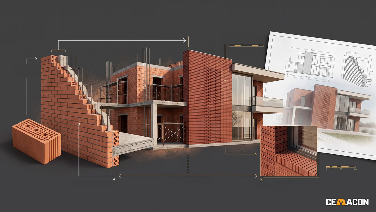
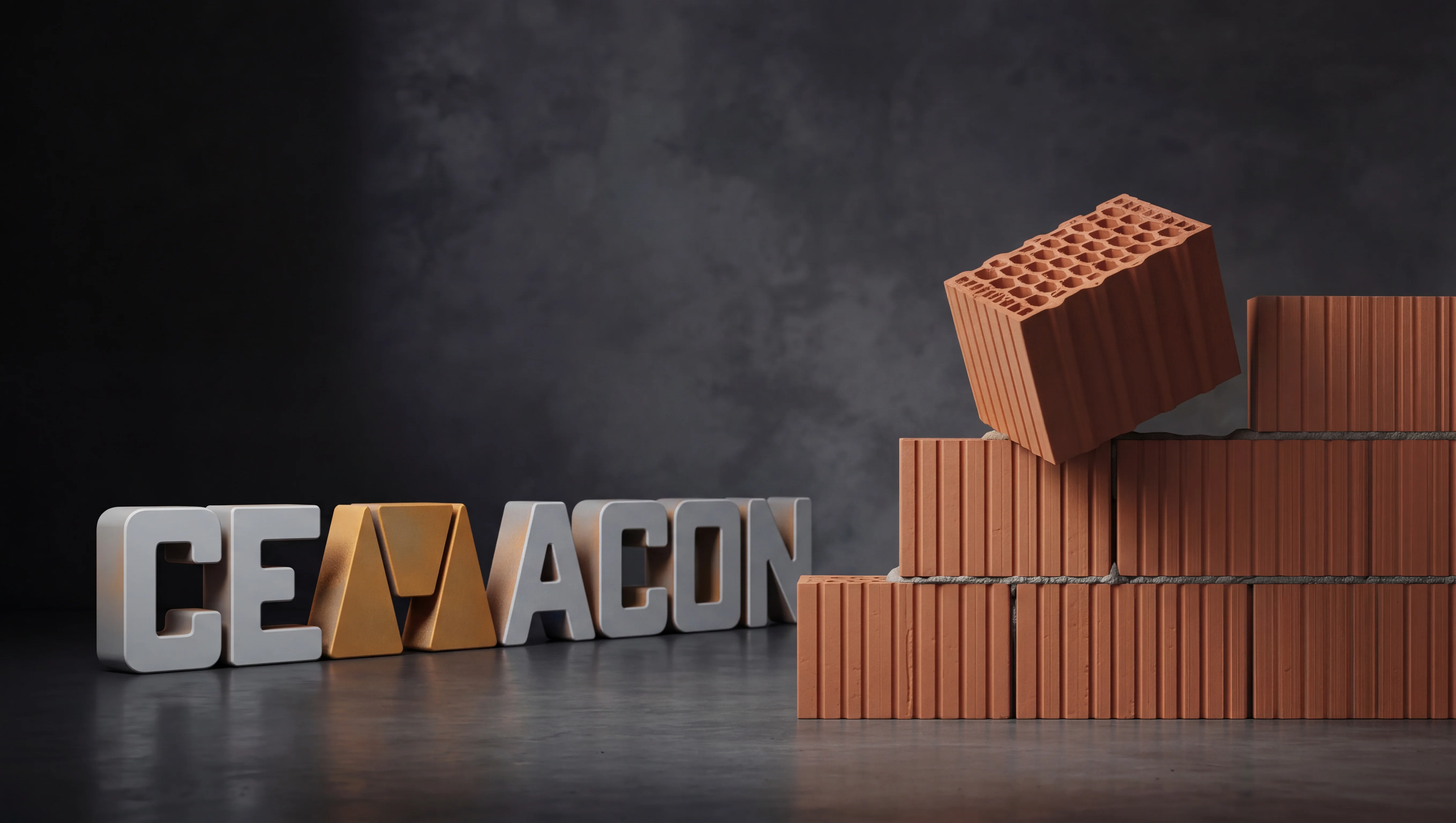
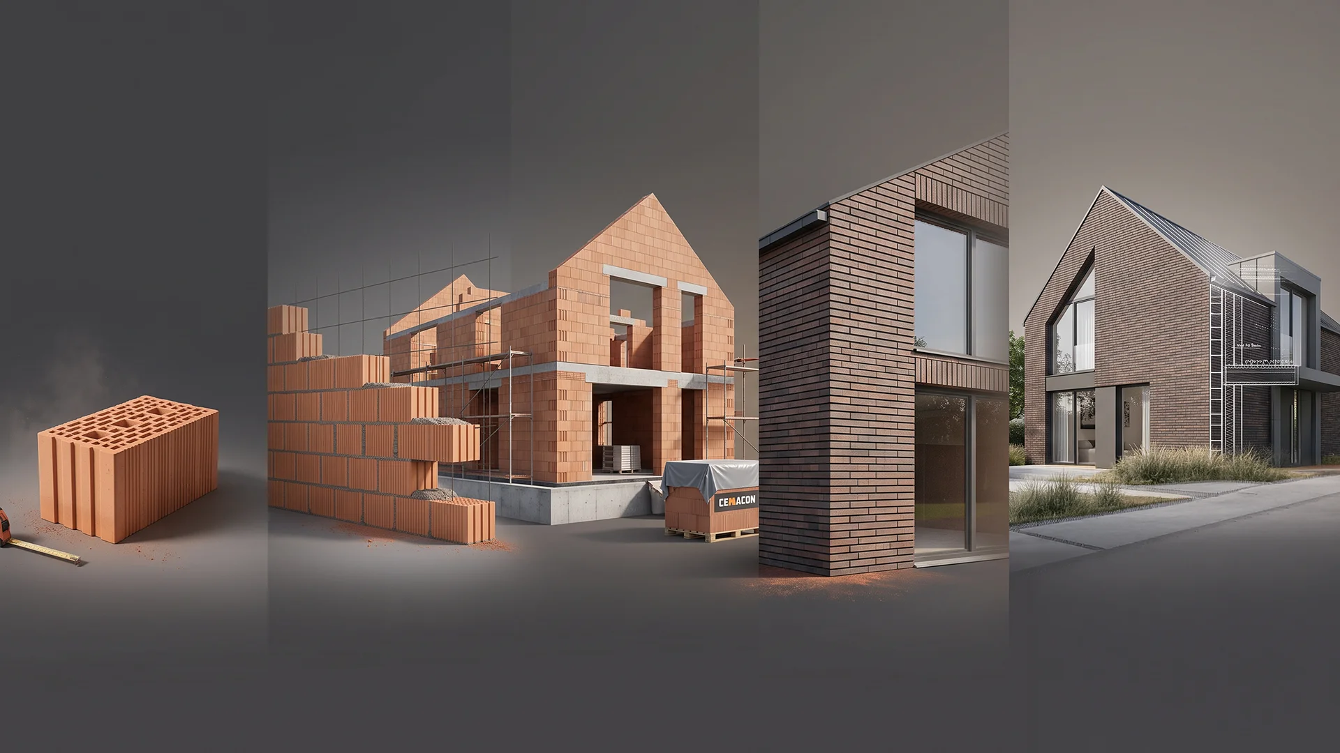
The answer was a scrolling experience in which the brick becomes the visual anchor and gradually evolves through several stages: brick → interior masonry → house under construction → exposed-brick facade → material detail → blueprint featuring Cemacon’s main solutions → the final structure.
Each transition logically builds on the previous scene. The same structure remains the visual anchor, and the product serves as the thread connecting the frames. We focused on visual continuity between scenes, preserving the product’s actual shape and proportions, alternating areas of focus to give space to the content, and naturally integrating the main product categories. In this way, scrolling becomes a narrative journey, not merely a visual effect.
Pathways for Different Audiences
A single platform had to meet very different needs. We therefore created access points and tailored pathways for architects and designers, developers, distributors, and professionals, as well as end customers.
Beyond the content, the website integrates useful tools: a material calculator, technical documentation, design resources, and reference projects. Each audience finds not only the right information but also the tools they need.
The Result
The redesign transforms Cemacon.ro from a technical catalog into a clearer and more useful digital experience.
Technical information becomes easier to explore, products are presented in the context of their real-world use, and navigation paths are clear for every type of audience. The memorable homepage, built around the product, integrates products, documentation, inspiration, and tools into a single, cohesive experience that matches Cemacon’s market position.